Project Description
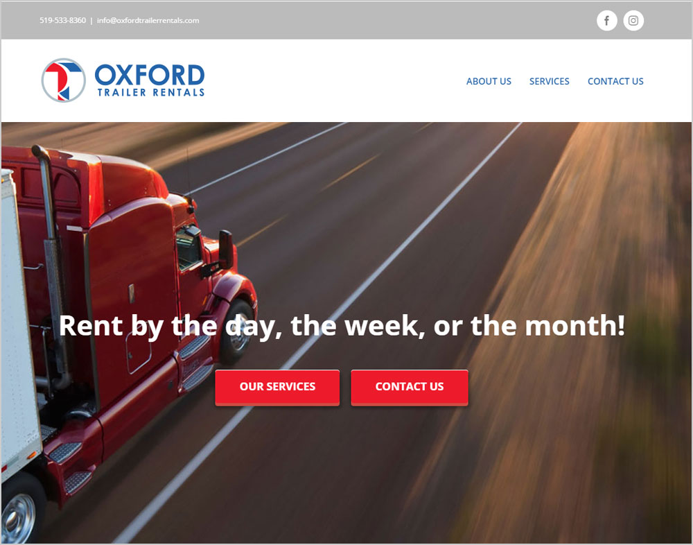
This project included designing a logo and developing a website for this new company.
The logo was chosen from a variety of samples, including one that incorporated a trailer within the text and shape of the name. This logo badge shield incorporates their bright red and royal blue colours. The OTR shortform of the name is found in the logo. The O in gray circles the full content artwork of the logo. The blue T and red R share the textual shape, and are split to their respective shapes. The split is a roadway along which the subject of this company can travel!
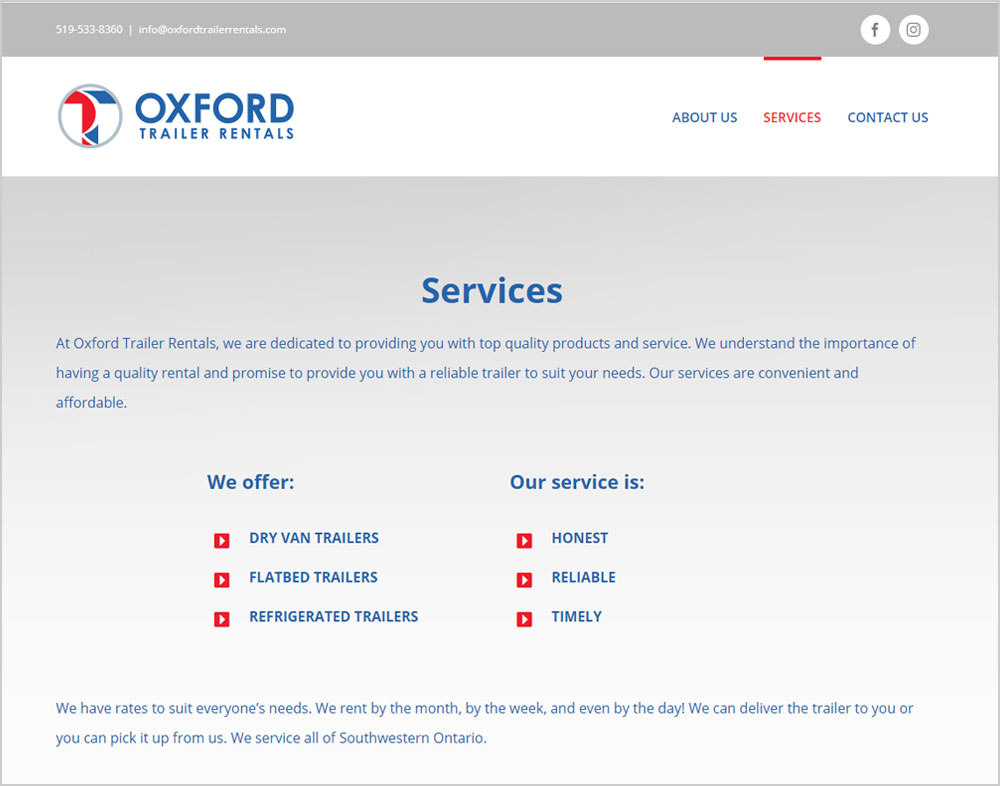
The website is a simple information based web presence. The website is a responsive WordPress theme, developed to showcase the services of this unique company. The design is clean and light to focus the reader on what matters.